Real Madrid's Annual Home Kit Accent Rotation: Interesting Evolution or Boring Repetition?
Each season, Real Madrid releases a new home kit - and one thing is sure - it will have different colors than in the year before.
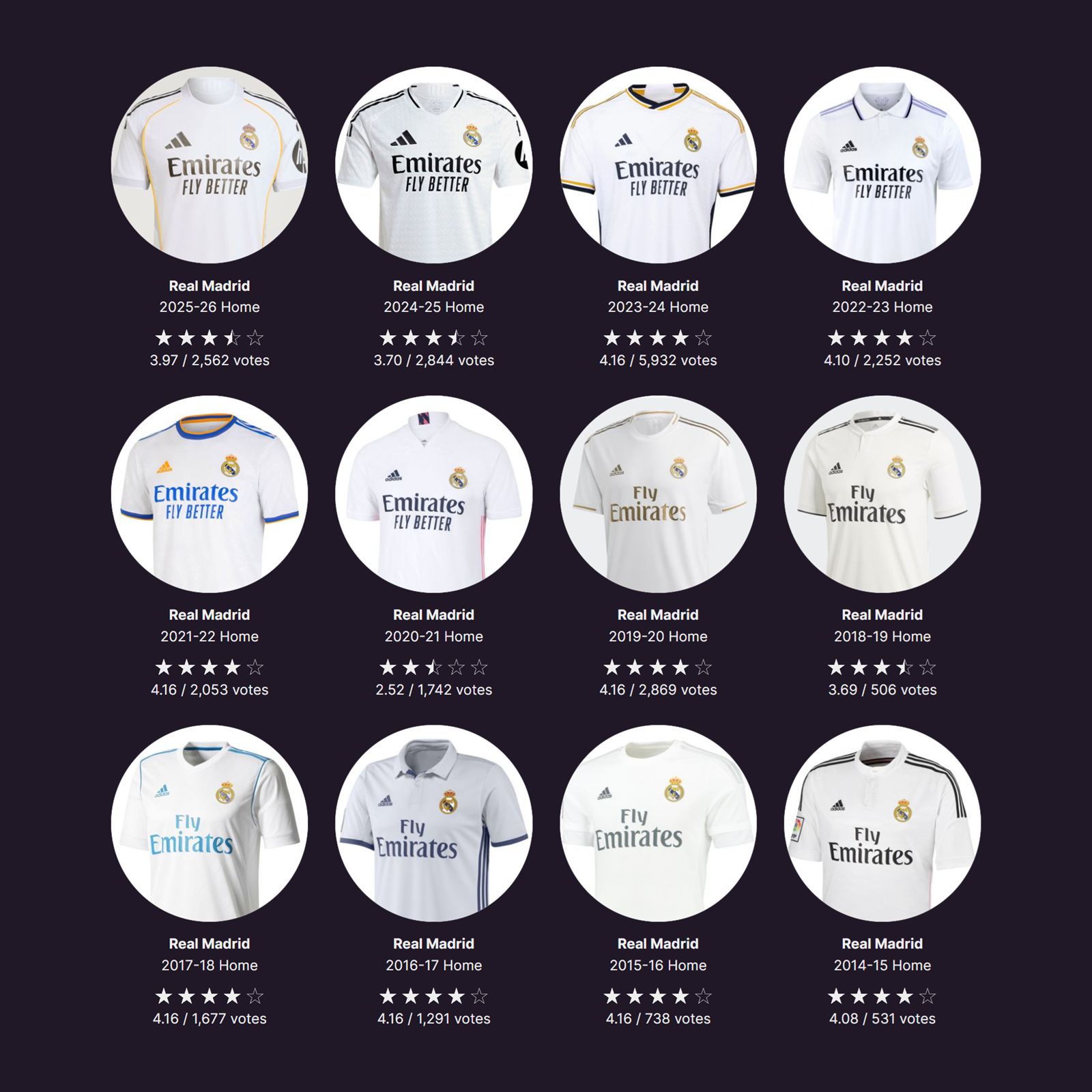
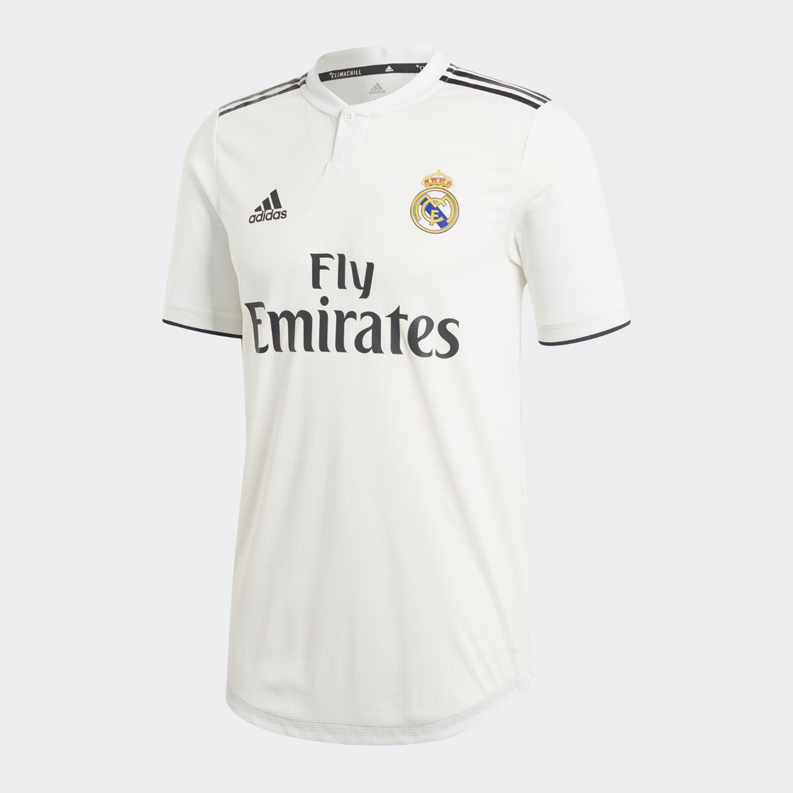
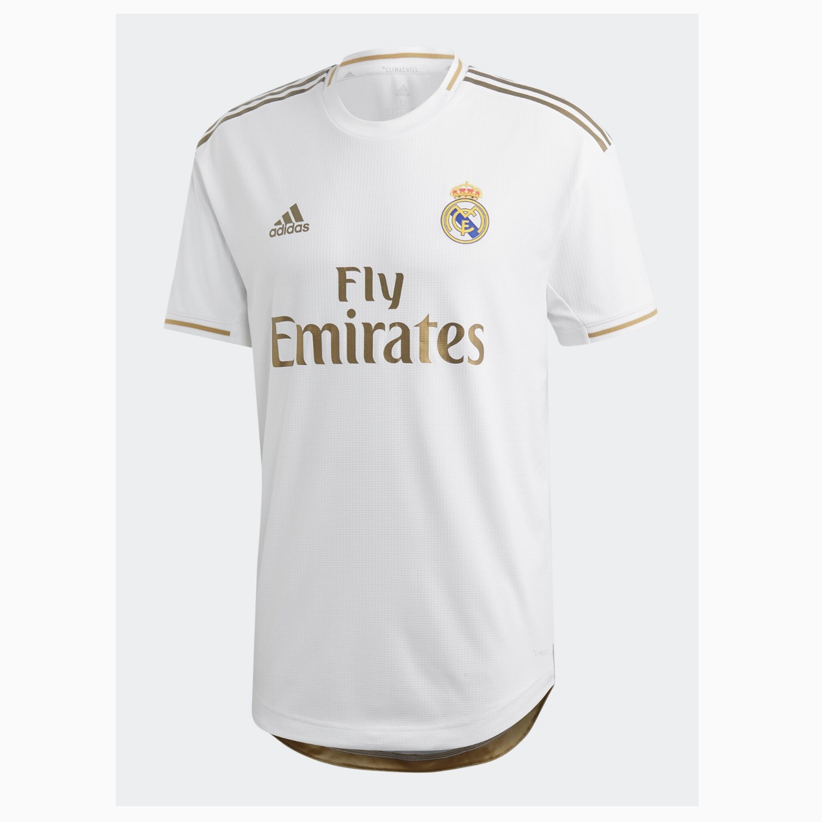
The white base of the Real Madrid kit remains unchanged (except maybe an off-white, as seen in 2018-19), but the accent colors adorning the collar, cuffs, and detailing shift from year to year. Purple one season, gold the next, perhaps navy blue or black after that.
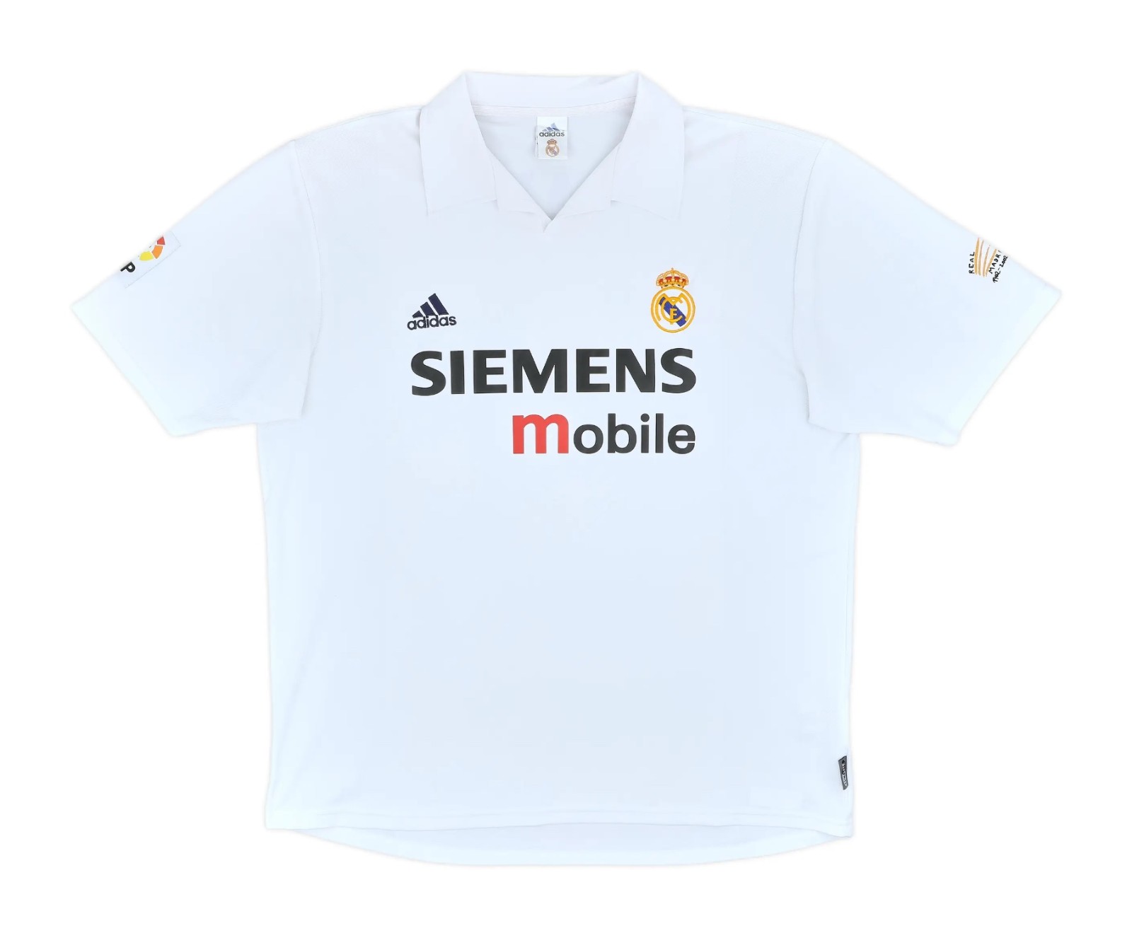
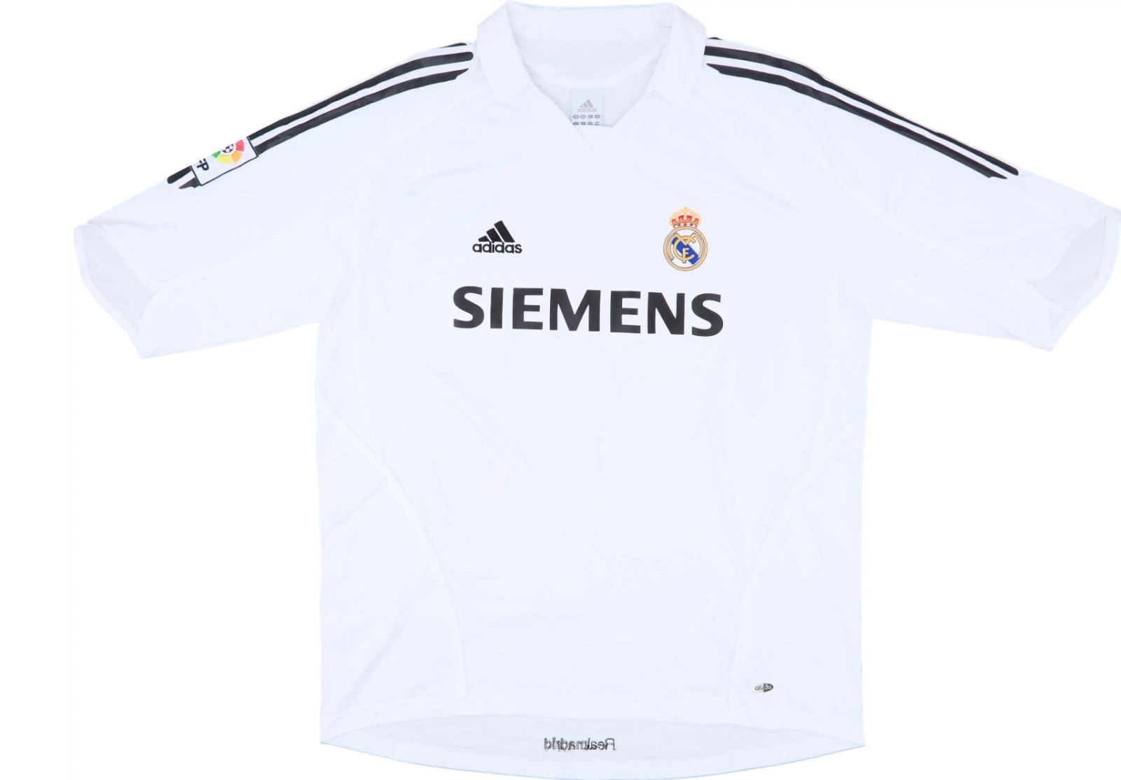 Back in the early 2000s, Los Blancos kept it very classic
It's a strategy that raises questions about where tradition ends and marketing begins.
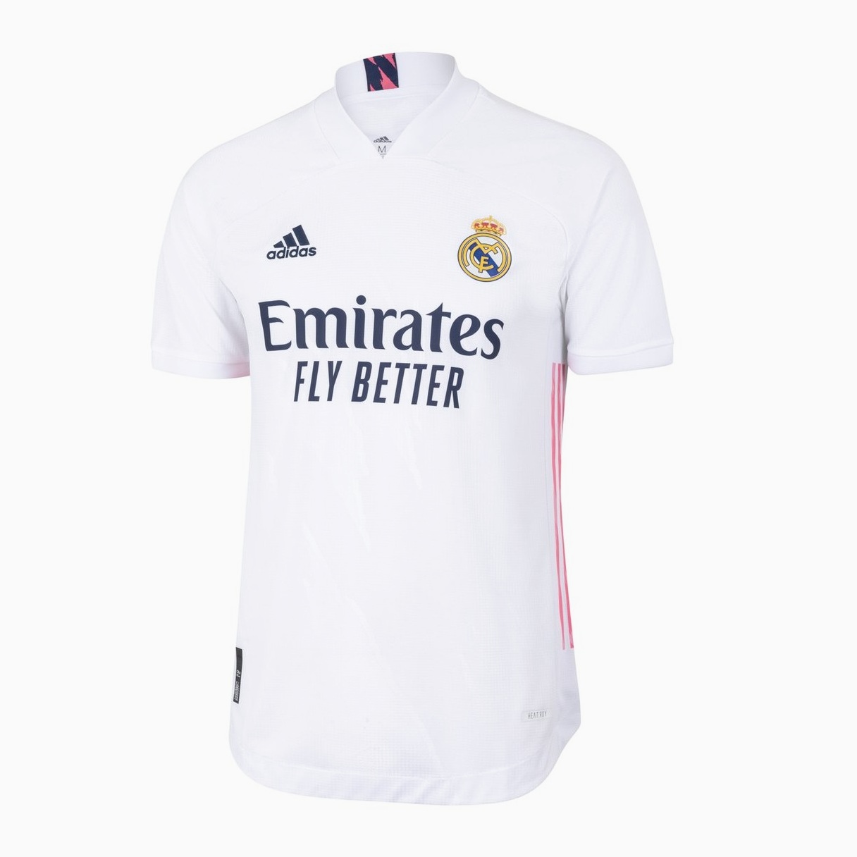
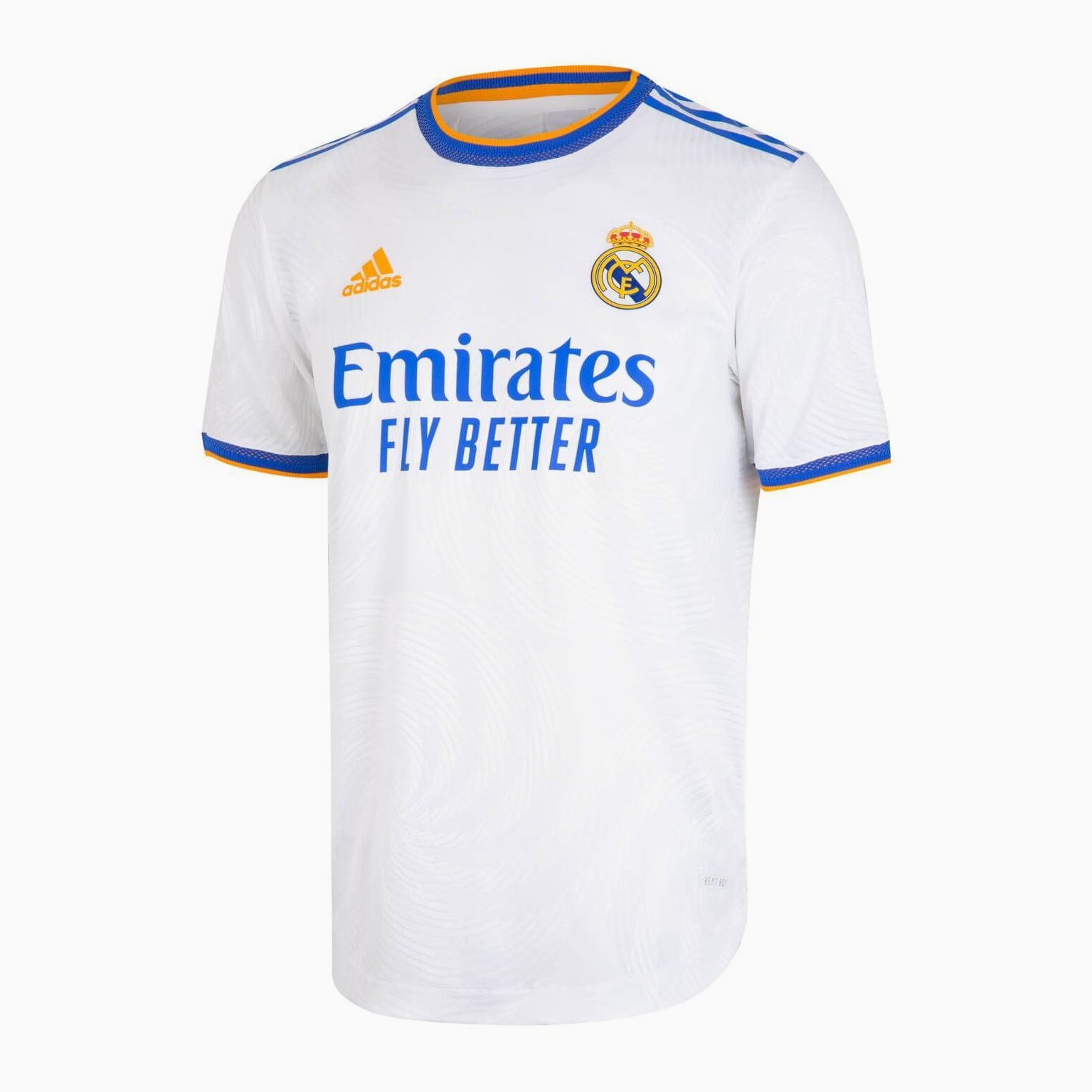 Real Madrid have used almost every accent color for their home kit
On one hand, these accent color rotations allow Real Madrid to maintain their unmistakable identity while giving each season's kit a distinct look. The variations create a visual timeline through the club's history, making it easy to identify which era a particular shirt comes from. There's something to be said for that kind of archival clarity, and supporters who enjoy collecting kits appreciate having genuinely different versions to acquire.
On the other hand, it's difficult to ignore the commercial convenience of the approach. By changing just enough to make last season's shirt feel outdated (but not so much that the design risks alienating traditionalists) Real Madrid has created a self-sustaining cycle of consumption. Fans are essentially purchasing the same product repeatedly, with only minor cosmetic variations to distinguish one year from the next.
The club's promotional materials inevitably frame each accent color choice as deeply meaningful, tied to Madrid's history or culture or some abstract concept of excellence. Sometimes these explanations feel genuine; other times they read like marketing copy drafted to justify a decision that was probably made in a boardroom based on sales projections and trend forecasts.
 For the 2026-27 season, Madrid will for the first time ever use green as an accent color
What's undeniable is that the strategy works. Real Madrid shifts millions of shirts annually, and the accent color rotation ensures a steady stream of "new" product without the risk of tampering too much with a design that supporters identify with. Whether you view this as savvy brand management or cynical commercialism likely depends on how often you find yourself purchasing those shirts and what is your general view of those things.
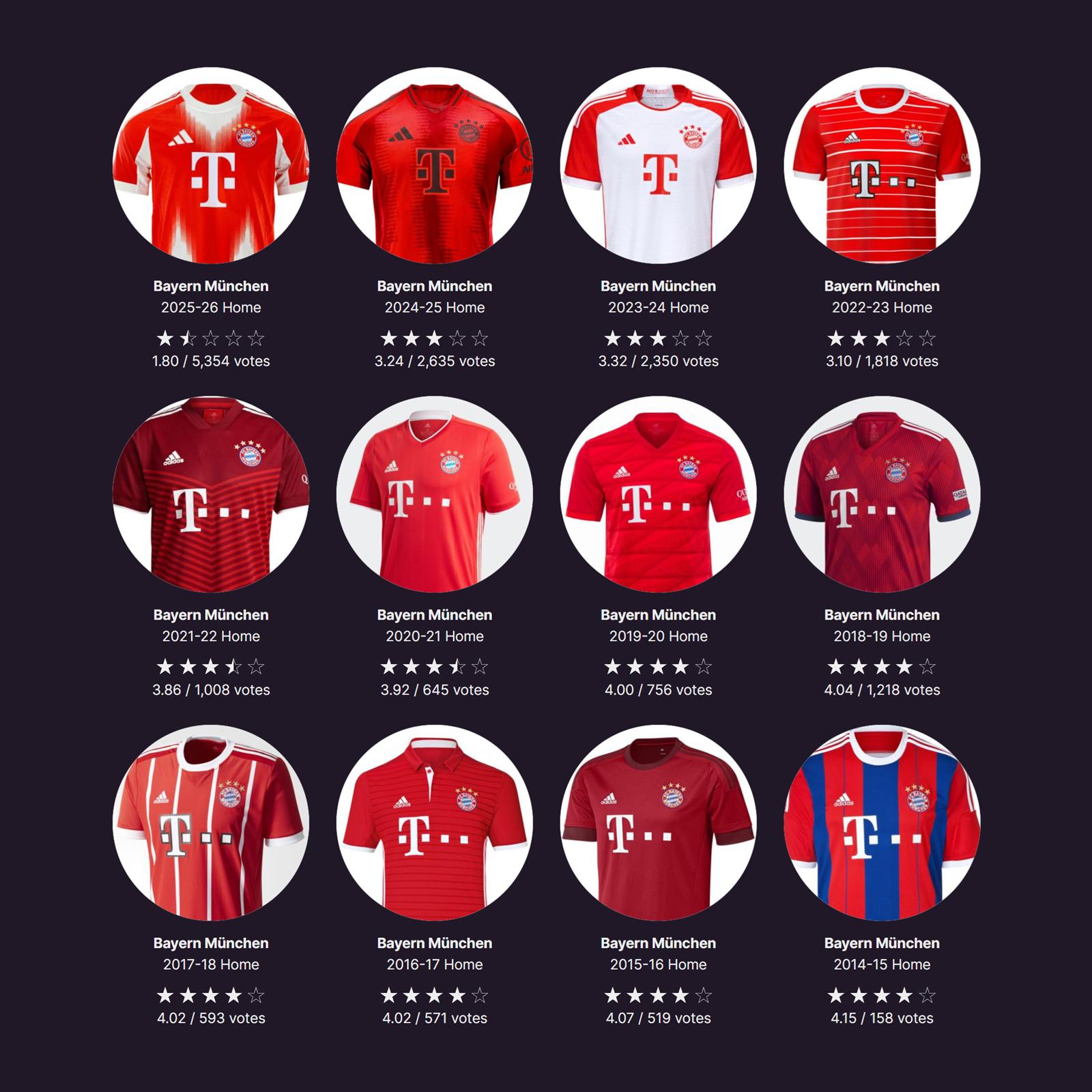 Many Bayern fans would love the consistency of subtle changes of Madrid - e.g. a red kit with not muh else
The truth probably lies somewhere in the middle. Real Madrid isn't doing anything particularly innovative or egregious - they've simply found a formula that balances heritage with revenue, giving supporters just enough variation to feel like they're buying something new without straying from what makes a Madrid shirt recognizable.
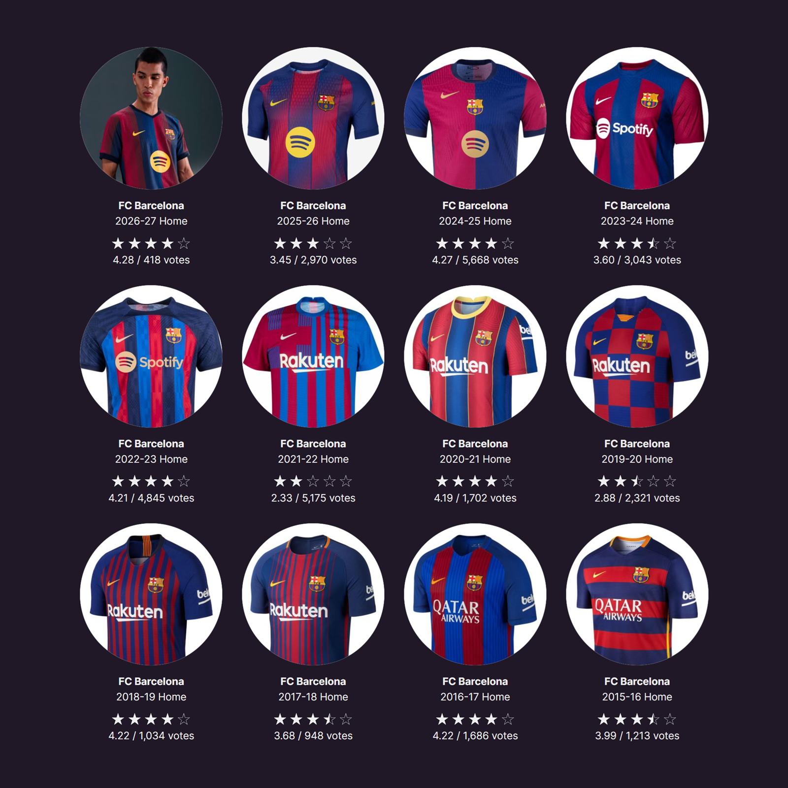
Other teams, such as their big rivals FC Barcelona, also keep their main colors, but opt for much bigger changes every season, with many of them denying the team's history - Madrid's subtle approach is surely more popular with fans, seeing the ratings of fans.